Monday, 31 March 2008

progress...

Gee, can you tell where I stopped painting the wall? A rather obvious line. And lovely split in the wall I still need to patch under the window. Will the Spakfilling ever end? Am not looking forward to doing the ancient window either...

Our bedroom/nursery is slooooowly coming along. The feature wall is painted and we're gradually getting around the whole room!! It's a little more purple than I would have liked, but I quite like so it's staying for now. Besides, I couldn't possibly do it again right now. I wish I could show you the finished product, but looks like that's still a little way off.
In-between drying times of the walls, I've stained the wood on my chair (and have to do it again, cause not dark enough. Bugga!) decided on my window stencil (Mokko - you obviously all agree), am making some new black and white wall art to stimulate bub and figured out what to do with the wooden chest of drawers that will double as the changetable. I'm going to cover the drawers and sides using wallpaper samples (similar to the wallpapered doors I posted a pic of recently) so fingers crossed I can pull that one off.

Cradle (and part of wall) before

And after

I also repainted the cradle - my aunty had painted it turquoise for my cousin's baby, but since I've been allowed to keep it, I gave it a dose of white to make it fit in a little better.
Until tomorrow..
x

Friday, 28 March 2008

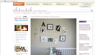
Zak's room on Ohdeedoh

There's something so familiar about this room...

I was very excited to see Zak's room and my handiwork on one of my fave baby-related sites this morning: Ohdeedoh. They posted the link to the real living site where I'd written an article on decorating a newborn's nursery in black and white. Quite odd to jump onto a site you go to regularly and see something of your own! I got a bit overexcited and even showed Zak (cause at 16-months, I'm SURE he understands!), but he did recognise it - he pointed to his monkey and swivelled his head to look around the corner to his room. Funny boy. Anyway, if you haven't checked out this site, you must. And not just because I'm on it - it's got great inspiration, advice, cool comps and heaps more. And if you don't have a baby, check out its big-sister site Apartment Therapy for the same stuff but on a grown-up scale. Thanks guys for the mention.
x

Thursday, 27 March 2008

Scrabble wall art update

Cool Scrabble art for your walls

I was asked if I'd managed to find out where these cool scrabble letters were from and I have! They're from Posh Tots and I thought I'd post the link in case anyone was interested. They're not cheap ($US400 for this pattern), but if you just wanted to do a child's name or favourite word, you can get individual letters for $US28 each, which is much more respectable! There are a couple of other options available too such as "sweet dreams". Cute!

Which stencil??

Surprise, surprise, my plans for the bedroom have changed yet again. This seems to happen to me a lot! Originally I was going to paint a swirly vine-like mural on the back wall going up over the small window to give a little privacy (after covering the glass with plain window film). Then I got over that idea and was going to use a decorative window film - this one to be exact. But in an effort to cut costs - again - I've now decided to stencil the window. And I need your help: I've narrowed my pattern down to these two...

Mokko pattern, $53.90, Stencil Gallery

Mokko in action. PS: Love the Eames rocker.

Tunis pattern, $55, Stencil Gallery

Tunis pattern in action

Seeing as you were all so helpful last time with my chair (I went with the majority - am going to stain it dark), I thought I'd do the vote tool again, see top right. Which do you prefer? And has anyone ever stencilled a window? I'm hoping it'll give me some privacy from the neighbour's balcony but still let light in. I also figure it's just a razor-blade scrape away from being removed if it doesn't work!
Love to hear thoughts as usual...
Bx

Tuesday, 25 March 2008

a little eye candy

Moroccan bedhead with the swish of a paintbrush.

Hope you had a lovely Easter break. Every muscle in my body is aching after spending all four days painting ONE wall in my bedroom and turning a turquoise cradle white. Good fun. Good work-out, too!
Just had to share a secret source of inspiration: photo agencies. Most will require you to be a member of the media and register to view images, but others allow free public searches and therefore free inspiration (if you don't mind the watermarked images!). Inside Photo is one such agency and is full of great home features from the famous (Coco Chanel, Valentino, India Hicks) to the not so famous, great seaside homes, country spaces, sleek city pads as well as a heap of great ideas and pretty pictures, some of which I had to share below. Enjoy.

Cute use for a vintage doily table runner

Love this rustic shelf. We had one in our old house made of a railway sleeper

Not incredibly practical, but cute

Coco Chanel's apartment. Her "take on thing off before you leave the house" rule obviously didn't apply to her very opulent and heavily-decorated home!

Love these old bi-fold doors as a screen/room divider

Friday, 21 March 2008

So-easy eco-chic idea

Eco-chic notepad - the front

OK so the last issue of Domino got an absolute panning (I can kinda of see why...) but I did get one bright idea from it - from the ed's letter page. She wrote about some of the ways her office was getting eco-friendly, one of which was clipping a whole heap of discarded print-outs to a piece of paper-wrapped cardboard (to make it a little prettier). We print on both sides in our office, but some pieces do get through, so I snapped a whole bunch up, and started collaging a wooden clipboard with some of my fave pics from our mag to it.

Underneath the front


The back

Just need to go back to my school days now and cover it in contact. Actually, it was rather nostalgic, like I was back in high school, collaging my folders. Only this time the supermodels, Bros and New Kids on the Block have been replaced, happily, with pretty pictures of pretty things. It's also a good way to keep your fave clippings without holding onto the whole magazine.
Go on, do it yourself. Who needs lined and bound notepads anyway?
x

Thursday, 20 March 2008

My thinking spot

My trip to work. Stolen from here (cause my pics turned out so dodgy)

No more nudity today, promise. Just wanted to share a little piece of my train trip with you. I am the first to complain about our public transport system, but I have to admit, I think I've got the nicest trip to work. It might be long (an hour and a half each way - on other continents I'd be crossing country's borders!), but check it out: the train line snakes right alongside the Hawkesbury River for about 15 minutes before disappearing in and out of bushland for another 20 or so minutes - and out of mobile phone range, which is heaven. It's the quietest part of my go-in-to-work days with with most passengers snoozing or gazing out the window. It's also where most of my story and creative ideas come to me. Must be all the beautiful scenery and my ability to switch off from the world while in my comfy seat. I call it my thinking spot - travelling thinking spot actually (unless it's one of those days where we're actually stopped unecessarily for a hour or so with no explanation). And I think everyone should have one place where they can think, write, draw, get creative or just chill. It's good for the soul. As a kid mine was in a tree in my backyard, then a rock near a river and now it's here, oddly, on a train. But with an inspiring view! Is that dorky or do you all have one too? Would love to hear where...


Thanks to a very bizarre NSW Government law, this little fisherman's hut may never be bought or sold. I'm not sure what this means for family's who run out of members to pass it down too, but I'd happily be adopted by them to keep it out of the government's hands! Pic also stolen (from here) as a houseboat rudely interrupted my already bad picture.

I especially love this little house. It's only accessible by boat and is not allowed to be sold - only inherited. Which is such a shame cause I just want to snap it up and rescue it and turn it into a holiday house. Not that it'd be far enough to class as a holiday home - I only live about 10km away! But I think it's such a classic Aussie home - I can just picture a little old man sitting on the verandah in a rocker complete with cork hat - and I am jealous of whoever is spending their Easter long weekend there.
Speaking of which, have a good one, drive safely and enjoy your chocolate - especially my fellow pregnant friends. Apparently a new study suggests women who eat chocolate while pregnant have happier babies. That's what I was told and I'm running with it - the proof is in Zak!
Bx

Wednesday, 19 March 2008

chalky self silhouette

Me, pregnant with Pud (baby's nickname), due in 11 more weeks

I got a little creative today. I say little cause it literally took minutes to do! I'd wanted to do a charcoal drawing like this when I was pregnant with Zak. Steve, being the arty one in our family and incredibly good with a pencil (his Harbour Bridge sketches made Art Express) was meant to do it, but before we knew it, Zak was here and we hadn't gone anything further than talk about it! So I was determined to do it this time around. But instead of using charcoal on a plain white canvas, I saved my $10 for the charcoal and canvas (hey, interest rates went up AGAIN you know!) and used what I had at home: leftover chalkboard paint, an ancient printed canvas of a red rose I never, ever hung up anywhere and the only piece of chalk I managed to save from the black hole in our ladder Zak was throwing them into.
Art was by no means my strongest subject at school (although if you compare my skill level to my maths skill level, I'd be, like, Picasso!), but I quite like the result: simple but rather effective. And it's a nice memory of a nice pregnancy without having to pose for photographs or apply plaster to my stomach. I may have been a tad generous on the perkiness of my bottom and bust (oh, and size) and it probably doesn't look anything like me, but really, isn't that what artistic licence is all about?! I'm going to put it in the nursery if I ever get it finished!
Have a good night
x

Tuesday, 18 March 2008

another great wallpaper idea

Pretty wallpaper collage from Posie Gets Cozy

We've all seen the many uses for wallpaper: walls, cupboards, birdhouses, books, canvases, frames... shall I go on? But yesterday I noticed the door on the house in the below post was also wallpapered. And what a nice way to give a room a pop of colour and pattern without committing a whole wall or wallet full of money! I wondered what else was out there in Google land and found this very cute patchwork-wallpapered door using scraps of various papers bought on Etsy. It's very effective and would work as well with different sized gift wrap or scrapbooking paper. And especially a good way to dress up wardrobe doors which we all know can be a bit boring if there's a whole wall of them, something I need to consider when we get our three-metre-long built-ins built in!

Monday, 17 March 2008

I want to live here...

You might remember this picture from the November issue of real living? It's easily one of my fave pictures we've ever run and ever since I saw it, I've wondered what the rest of the house/room looked like. Pinning it up on my bedroom moodboard today made me determined to find out more. And I did! Such great investigative skills I have... Through the agency we bought it from, I discovered the photographer, Trine Thorsen found his/her website and more pictures. (Ok, so maybe not so tricky!) According to the photo agency we bought the picture from, the shots were taken in Oslo and I think you can tell - it's got that gorgeous Nordic feel about it. I think it's the perfect mix of cosiness, style, rustic, trend and whimsical. And if I could steal only one piece from this photo it'd definitely be the rug. I'll be forever grateful to anyone who can identify it!?! Ok so sequins on the floor might not be the most practical thing in a house full of children but I might be able to work it in somehow... Anyway, here are a few more shots of the room and a couple of others in the house.


Too pretty!

I often find the best spot for inspiring pictures are photographer's websites and wallpaper and fabric stores. I'll post a few more great interior photographer's in coming days, but in the meantime, check out the rest of Trine's eye-candy work here.
Nighty night!

bedroom makeover pt2

Some of the inspiration for my bedroom. I want a little bit of every picture!

Devastation: the wallpaper I wanted for the bedroom (Mod Green Pod's Grand Jubilee in Cream) is not available here and they don't ship internationally. Boo hoo. But the good news is, they've asked me to send them some cool wallpapers stockists as they're looking to expand here in the future, so if you know of any, let me know...
So, my vision for the bedroom has already changed. A little. My second option - paint - has also varied. It seems there is no browny/purpley/grey out there that resembles the cushions I wanted to match it too. Well, I'm sure there is, but a couple of trips to paint shops and one very bad match attempt has already caused me to lose interest so I'm going with a lighter version of it. As luck would have it, I already have a tin! It's Porter's Paints Phantom and is a darker version of the colour in Zak's room. I bought it yonks ago for my husband partly as a joke cause he loves the word "phantom" so I thought it'd be a nice feature wall for "his" room (our converted garage/second living area/his computer space). But I'm stealing it now for the bedroom.

Completely obvious but still handy tip: never paint a wall without testing a sampler first! Paint is ALWAYS completely different to the paper sample and how it looks in the tin. And dries darker. Much darker!

The colour I bought as a sample turned out to be way too purple as you can see from this lovely patch of it at the bottom of the picture below. The Phantom colour are both the top centre and right splotches (the centre one was before I mixed it properly!) and the top left is Porters Paints Blue Cow and is obviously nothing like what I was thinking but I had a sample of it so gave it a go anyway.
So here is the start of my moodboard (very top) - basically just tear sheets of pretty pictures with colours, textures and items I love. I'll add to it as I find things.

Swirly inspiration

And this was the inspiration for my feature wall. It's from a clothing shop in Sydney I snapped (badly, sorry!) the other day. Could my grey get any different!! But I love the swirl pattern and will give it a go. If it turns out bad, I can just paint over it!

Saturday, 15 March 2008

Thank you, thank you

Virtual thank-you flowers for Holly

A huge big thank you to Holly Becker at Decor8 - one of my fave websites and first stop for inspiration. She wrote a post a few weeks ago how sewing is such a handy craft to know and that we should do it more often, and I commented I was up for the challenge and that I was going to attempt to make a bean bag for Zak's room and asked if anyone knew any good patterns. Next thing I know, she's sending me a free Amy Butler Gum Drop Pillow pattern she had left over from a competition. So, so nice. In return I sent her a pile of real living mags to pore over and hopefully give us some expert-eye feedback on! My pattern arrived on Friday, gorgeously wrapped as you'd expert from a style guru, and was perfectly timed: I'd just had my mum strapped to a chair making her fix the sewing machine for me... Well, it turned out it wasn't actually broken, I just didn't know what I was doing! But I do now (it's coming back to me) and am super-keen to get started. Was also thrilled it was an Amy Butler design - her fabrics are so gorgeous and I often just spend ages on her site perusing all the pretty pictures and patterns. In fact, we're all rather taken with Amy at real living - look out for a feature on her in an upcoming issue!

My giraffe-print fabric, beautifully wrapped Amy Butler pattern and quite possibly one of the country's oldest sewing machines all ready for action. I was secretly chuffed to see Holly had used photocopied Amy Butler fabric to wrap the pattern in - after we used the exact same print in a shoot for the mag last year, I stocked up on photocopied versions of it as wrapping paper. Makes a nice change to the usual store-bought varieties. Oh, and the cute card is from Ink + Wit - gorgeous stationery and art.

It's just another great example of how sweet and helpful the blogging community is - especially when you share an interest. Before I became completely obsessed with this world, I'd spend my free time reading gossip sites instead and I cannot believe the bitchiness that goes with it! It was enough to scare you into not commenting on anything ever again. So I've pretty much given up my celeb fix - most of it is made up anyway or about people I'd be happy to never hear about again - and stick to pretty, inspirational things, people and places. It's much nicer on the eyes, healthier for the soul and so much more useful for around the home!
So anyway, thank you again, Holly, I just hope I can do Amy's pattern some justice... Will keep you posted!

Amy Butler Gum Drop Pillow in Imperial Fan

PS: On the topic of Amy, after seeing this picture (above) on the gum drop pattern's cover, I'm thinking that fabric might be a serious option for my chair. It'd be a good way to get some print into my home without going too bold... It's my current fave!

Wednesday, 12 March 2008

Sweet tweet

Hanging steel bird, $36, Nomades at www.realshopping.com.au

In case you've been living in a cave somewhere with no magazine and internet access, just thought I'd let you know bird motifs are huge. They're everywhere! I'm not sure why or what started this particular trend, but from fabric to wallpaper to stationery to shop emblems to store windows to blog logos and way beyond, little tweeties and their woody homes are adorning everything.

Anthropologie store window. Pic from A Design Affair

Look! A trend within a trend: wallpaper-covered birdhouses by Osborne & Little (and Anthropologie, above)
I thought this was one trend I'd managed to bypass, but a quick look around my home discovered in the past two years I've bought notepaper with bird motifs, an address book covered in sparrow silhouettes and have stuck little paper doves on my son's bedroom wall. I also own a bird necklace and have often carried a little wooden birdcage to the counter at my local store but put it back because I can think of many other ways to spend that $50.
But then last week our builder's wife found a real bird's nest knocked out of a tree across the street and being attacked by magpies (the same week I saw a spider wrap an ant up in its web and kill a fly - the Discovery Channel had come alive in our place!) Not sure what to do, she shooed the maggies away and rescued it - complete with one poor little cracked egg - to show Zak. In the day I left it on our porch that poor little egg was been smashed to oblivion by other birds, but I thought the nest was worth keeping so here is my take on the bird trend - and yes, I had to add a little bird to it of some kind, so I cut a bird shape out of pretty paper and stuck it on the wall!!

Tweet tweet!

Any ideas of what to do with the actual nest? I don't know if I should put anything in it or leave it bare. Nice spot for the Easter Bunny to leave a yummy chocolate egg though don't you think?!

Monday, 10 March 2008

Bedroom makeover pt1

My bedroom inspiration: from Domino magazine

How attractive is this picture? I wish I could say it's my main bedroom, but that's to come... I couldn't start the post with such a hideous picture, so instead I thought I'd show you my inspiration for the room!

This, sadly, is one end of my bedroom! And it's the better end at the moment!!

This room (above), however, is my bedroom and believe it or not, this is a MAJOR improvement to what it was... The old wood panel and wallpaper we ripped off left major ancient strips of glue and were a bugger to remove. Then all the moving around of the doors and windows cracked a lot of the walls and left nice uneven sections on others! So this is the result of my Sunday: I spent most of yesterday sanding, filling, sanding, filling, painting a little then more sanding and filling and it's still not perfect. But getting there. I think if I'd got a painter to quote me he would have turned down the job!

So back to the pretty picture. I've loved it since I saw it a few years ago in Domino magazine and am using it as my inspiration and the starting point for the moodboard I'm going to create. Because this is going to be our combination nursery/master bedroom, I want it to be a nice serene place in muted greys, browns, whites, blushes, lilacs, silvers and maybe a hint of buttercup or blues. I'm actually pricing the exact same wallpaper that was used in this headboard for that wall but I have a feeling it'll cost me a bomb because the rolls are a little small and I'm trying to save $$$, so I think it'll be paint for now!

So the wall you can see with the little window above will be a darkish browny/purply grey like the pillows in the Domino picture and I'm going to (attempt) a freehand swirly vine pattern from one side in a metallic silver... I've always loved greys and purples together in a bedroom - I think it's the perfect male/female compromise and is easily built on to include pretty much any other colour. I also find it really serene and calming. I just hope the dark wall doesn't make the room feel too heavy, but I think there's enough light (what with the five windows and full French doors!) to balance it out. But has anyone used a dark greyish paint before in a bedroom? Any recommendations? Would love to hear your thoughts as usual. This should be an interesting project - I wonder how similar or different the image in my head is to the final product!
Have a great night.
x

Friday, 7 March 2008

decorating with plates

A modern way to display vintage items from the March 2008 issue of real living

Well it's certainly nothing new. In fact, we did it in the March issue of real living (above), although we tweaked the trend a little by using silver platters. But I came across this idea on the Matthew Mead Style website (check it out for simple projects, yummy food, and free downloads such as wrapping paper and gift tags) and had to share as I hadn't seen it done before: using a plate as your house number.

Cute! The rose template is available to download from Matthew's site here if you want to copy

And so simple too. Scour antique shops, try your local charity shop or raid Granny's cupboard if you don't have a suitable style and then pop on your house number any way you see fit: handpaint, stencil, decal...
But if you want to be even bolder, try this one on for size:

Bold & beautiful - the Viceroy Hotel in Santa Monica

This is in the pool area of the Viceroy Hotel in Santa Monica designed by Kelly Wearstler, but would look equally as stunning on a dark feature wall inside your home. I'm in love.

Thursday, 6 March 2008

What would you do with this chair?

Great bones, decent fabric, lovely legs - a bargain for $40

This is my latest buy - just $40 from Vinnies! Usually I see something and then wait a day or so cause "if it's still there, I'm meant to have it." But this time, I just grabbed it. Good thing too, because it had been in the store for a whole 20 minutes, didn't even have a price tag on it, and while it was being stored before I picked it up, a fair few women were peeved I beat them to it! Since handing over my cash, most of my free time since has been trying to decide what to do with it. So I thought I'd make it a little community project (plus, I want to use the "vote" tool just for fun - cast your vote to the right.)

Ready for my close-up

I quite like the fabric - for now - but am debating either to Black Japan the wood (a really dark brown stain) areas or make them distressed white. I'm thinking the fabric I eventually cover it in should be light as so much of my furniture is not, so a duck-egg blue would be brilliant in the living room, but then a creamy colour would be perfect for the bedroom which, when it is actually finished, will be creamy blushes, greys, whites and silvers. IF I get my way of course...

Easy-peasy earring storage
For the moment, it's quite nice paired with my nana's old mannequin and earring display, which by the way, is super-easy to make. Just tie some cotton around the ends of pinboard pins, jab into the wall and hang your earrings from. The holes are easily filled if you want to move it, but in my case, the walls still need to be painted, so no problem!

So, any fabric suggestions? I had a super-quick look online this morning and found these from Warwick Fabrics.

Warwick Fabrics Cayman in Cocount

Warwick Fabrics Sketch in Ice

Warwick Fabrics Spin in Pearl

Warwick Fabrics Splendor in Pearl

What you think? Any other ideas? All welcome.
Bx