Wednesday, 30 January 2008

March issue out now!

The lovely March issue made its appearance on shelves on Monday. Check it out - it's got some inspiring pics (I love the tree on the wall - might have to do one in Zak's room), great features such as buying property with friends or family and how to break your bad habits, and a 19-page special on kitchens and bathrooms including, in case you haven't seen enough of it already, my bathroom makeover!

Here is a sneak peek to get you started, and don't forget to check out the website for projects, recipes, ideas and a little look inside editor Deb's house. And feel free to let us know your thoughts.

Pretty March issue with bedrooms you won't want to leave in the morning

Meanwhile, our house's exterior is coming along nicely. The weatherboard is up and has made a huge difference. But thanks to the stinking hot weather on the weekend, my painter (hubby, Steve) only managed to get half of it painted. Bludger! I'm thinking of firing him - tradespeople huh?! haha

Thursday, 24 January 2008

Exterior makeover

The exterior of our house is getting a makeover. Hurrah! It's at this very moment being banged and crashed at while I'm meant to be working and Zak is meant to be sleeping (he's banging back on the walls!) so I thought I'd show you some of its looks. It's not the first time it's had a revamp. About 18 months ago we moved some windows around, added French doors to our bedroom and put on a deck. Then about two months ago we added a couple of windows to break up the huge wall on the left wing (it's in no way a mansion, just the best way to describe its L-shape) and Steve gave the whole deck a few coats of paint. Now, we're tidying up all the mouldings, putting weatherboard halfway up and uniforming the architraves. Well, I say "we", but our builder is doing the hard work, and Steve will be painting it, so my job is really to order the paint and offer coffee. But hey, I'm pregnant so I'm allowed to ease off on the hard work!
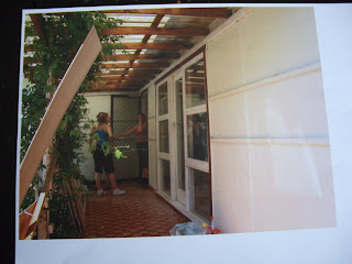
Here's what it looked like the week we moved in... (not so great images as lost the disc and had to take pics of the pics!).

BEFORE: You can barely see the front door through the bushes, lattice and vines. And car.
Our front door. Well, two front doors actually. We closed up the one with the screen (which my mum is hanging out of!) and just use to glass one now. It's amazing how much light was let in once the lattice and vines were removed.
The garage had been converted (badly) into a room when we moved in. Here is the door that didn't close properly and leaked every time it rained! Notice the lovely wood panel pile? That was what covered the walls in the lounge room.

Our bedroom windows. The actual room takes up 2/3 of that whole left "wing". The other 1/3 is Zak's room and the hallway.

DURING: This is just after our deck was put on. We have since put the French doors up the right way!! And we added windows to break up the huge expanse of wall.

Our bedroom windows replaced the old sliding door and I can't remember why we stopped the deck there. I'm sure there was a reason... It bugs me that the stairs don't line up with the door, but I'll get over it. One day we might one day replace the whole window and door area with bi-folds (if we can do so while keeping mozzies out).
Stay tuned for more exciting news on my house's cosmetic surgery!
Bx

Tuesday, 22 January 2008

What you didn't see in the pics below...

Probably shouldn't do this, but heck, I'm a real person and this is life, right! OK, here's what the rest of the room looked like yesterday. Let me point out that it doesn't actually ALWAYS look like this either. A combo of the two is just about right!

The hall stand is also not usually in the middle of the room - it's going to go in the space the bookshelf left for now until I find something perfect for that wall - but hey, the paint had to dry and it had to go somewhere! Zak's ever-increasing transportation options are also not usually blocking the front door but would have ruined the look of the room - and you can't possibly have that!

Zak's toys take up this corner usually, but luckily, the angle I shot the pic from, they couldn't be seen!

We moved our huge cubed bookshelf to another room to paint the wall behind it and so everything in it is calling our dining table home for the moment. There's also a pile of Zak's toys hiding behind the couch.

My other cheats in the room were...
- The cushions are actually just older cushions wrapped up in new fabric. I did buy the fabric to make cushion covers but only managed to get three sides sewn before the sewing machine packed it in (I'm very good with getting appliances to work, obviously).
- I flipped the rug around and moved the coffee table into the middle of the room so it looked better. Usually, Zak gets free rein of the whole rug and the coffee table is closer to the other couch. And just a week ago, my rug was actually those coloured foam alphabet square puzzle pieces. Until they became a snack instead of a playmat for my monkey child.
- Normally, the coffee table is covered in cups, blocks, snacks and remote controls.
- The picture of Zak on the entertainment unit was moved there to hide a little signal box and fill the gap.
- The wicker chair is usually in our bedroom cause that corner is constantly changing - the ottoman was there, then the Christmas tree, now Zak's pram and bike...
- A huge green baby Shrek toy is usually sitting on the brown two-seater couch, but was banished.

In other news, I've managed to keep the coffee table the same for a whole day and a half. I guess it helped that I wasn't at home today....

Monday, 21 January 2008

my lounge room before & after

Thought I'd start the ball rolling with room makeovers by showing you one of my own. Unfort I can't find a before pic of what this room really looked like untouched (think spew carpet, wood panelled walls and concrete spray-on stuff on the ceiling with a huge window where these two smaller ones have been put instead) but these are "during" pictures! And seeing as the room was half clean today, I figured I'd tidy the rest of it and take a few snaps with the camera I stole from my parents (thanks guys!) for the week while Dad tries to resuscitate my own.
Now, this room is never totally finished - we still have bits and pieces to do and I'd love to add more colour, but it's getting there.

BEFORE: The bi-fold doors are our addition. You used to go to the room next door through the toilet (!) which has been sealed up to the left of the TV (which for some reason is on in every single of our reno pics!)

BEFORE: These two windows replaced on big one and a tiny air conditioner. The lighter gyprock is where the window was - the different colour paint swatches is us testing the multitide of white paints available. We chose Dulux Whispher White. The hand-me-down couch had a good long life and certainly did the job, but was thrown out in our last council clean up. RIP.

AFTER: Two Freedom coffee tables pushed together make up our entertainment unit, my zebra rug makes the floor a little comfier for Zak and Steve to wrestle on, and the wicker chair in the corner is usually home to Zak's pram, bike and push-a-long car!

AFTER: I'm still undecided about the brown architraves around the window. Steve loves, I can't decide... Through the window you can just see a hint of our cabin - another project on our to-do list!

And before you get cross at me for making it look like I live like this with a small child all the time, I'm here to happily tell you I completely cheated to get it looking this way and I'll post the pics of what I left out of the shots tomorrow (so you have at least one day thinking my house looks relatively nice)! Isn't photography a brilliant thing? So before you scold yourself for not having a magazine-perfect home when you flick through them, remember it takes a whole day (sometimes two!) to get the home looking that way and all their toys, scrap paper, bills and signs of normal family life are carefully tucked away to the left or right of the shot! Unless of course it's my sister, Kristie's house. She really lives tidily. I think the only reason she can handle visiting my place is that she gets to play with Zak! haha
Bx

Tuesday, 15 January 2008

Show us yer... room makeovers!

OK, so who has cool renovations pics they'd like to share? I'm starting a new section on the web - reader's rooms - and am looking for contributions. Basically, if you've renovated any part of your house, are thrilled to bits with the results, came up with some genius storage or decorating idea, found some awesome bargains or brilliant furniture/material etc, we want to know about it!
Think of it as a little perve inside real living reader's homes. Tell us what you've learnt, taken our advice on, ignored our advice on or just how you've improved your life and home simply by reworking a room.
Send your before and after pics to me at bgraham@acpmagazines.com.au and we'll sort through them and choose a few for the website.
Looking forward to virtually visiting you at home!
Cheers
Belinda

Saturday, 12 January 2008

latest zebra print acquisition

My little crush on zebra print has surged to a bit of an obsession... While trying to pull my nose out of the new CLEO offspring - CLEO Click - to do some work, I discovered this rug on the ezibuy website.

It's not a skin, but that's cool cause I needed something "spongier" for little baby bottoms...

After considering it for a whole two seconds (surprising, since I've said before I didn't think I was quite ready to go so bold as to put an animal print on my lounge room floor), I logged on to the website and before I could stop it, my hand was bashing in my credit card details and shipping address. Certainly an impulse buy, but at just $50 (half price!) who seriously cares?


I've never even considered Ezibuy before. My mother-in-law swears by them and I've flicked through their catalogues a few times and been surprised at some of the nice clothes they have, but never thought of them as a place to buy homewares. But they look great for Egyptian cotton towels, bed linen, cool toys and personalised stuff for kids. And if you're ever stuck for gifts for a new baby, you have to get their Tippy Toes socks. Zak got a box of 6 bright-coloured soccer boot socks for Christmas complete with tie-up laces and they're the cutest things ever (in sockwear!) And the price of shipping, you ask? A flat rate of $9.90 - not so great if you're only spending a few bucks, but brilliant if you're buying a 180cm by 130cm rug!

Tippy Toes socks, $25 for pack of 6, Ezibuy

And getting back to the cause of this mini spending spree, CLEO Click is a new mag dedicated solely to the web. Everything in it is available to buy online there are awesome sites to check out for everything from decorating your home, to the latest gossip, to how to buy or sell a car, to sorting your life out when expecting a baby (brilliantly explained by a former colleague of mine - and brains behind the mag - Lou).


Be warned: you might become glued to your computer after reading this...


The last time I looked at a CLEO mag was when I worked at Cosmo three years ago so I was little shocked to find myself walking to the counter with it in my hand. But it's a great concept and not just dedicated to fashion. Or sex! Pick it up and be amazed at all the cool shopping site, blogs and sites you've been missing out on! Enjoy...

Wednesday, 9 January 2008

Kitchen renovation time - yay!

Have suddenly become obsessed with kitchens as we've decided to get moving on ours. And this picture started it all. I found it in my Cosmo Pregnancy magazine (of all places!).

Picture from Getty

Not that there's much to see in this pic, but I love the open shelving and the crispness... I was all ready to go white everything (my usual first choice!) but then I saw the cover of this IKEA kitchens catalogue and basically want this colour theme - white cabinets, dark grey glass splashback (without the twig feature, as nice as it is) and lime-washed beechwood benchtops.

Love this look
So combine these two pics and HOPEFULLY that's what our kitchen will look like. For under $10,000. Think it's doable? I do. Here's my plan (so far): flatpax cabinets from Bunnings. I've already worked out the measurements and added it up: $2000 for whole room. I think I can get the appliances for around $2000, I'll have my builder quote me the open shelves (I'm thinking maybe $1500) and that leaves a fair bit for all the rest. I actually think we'll get it all done for about $8000, but always better to go a bit over to make room for any surprises!

So, my question to fellow renovators is this: Has anyone put in a Bunnings flatpax kitchen and if so, how do you find it? They seem fine to me - to me a cabinet is a cabinet (they're all pretty much made out of the same stuff despite the ridiculous prices some places charge) and I'd rather put my money into the things that'll get more wear like the benchtop and appliances.

Would love to hear your thoughts and what people spent on their kitchens. Am I in dreamland thinking I can get it done for under $10K?????????

Cheers, Bx

Thursday, 3 January 2008

Tell me what you really think...

Seeing as I'm without a camera and therefore unable to post anything relating to what this blog is meant to be about, I thought I ask for some feedback on the real living website.

Our website's homepage. Love? Hate? What could change?
In case you didn't know, I'm the website editor now and have my fingers crossed that this year, we'll be able to revamp the site. In the meantime, I'm hoping to get some video footage up of behind-the-scenes of real living shoots and will be doing a few staff profiles - starting with editor Deb from next month - about their fave rooms, their decor style and secret shopping haunts. Sooo, anything else you'd love to see on there? Please let me know what you love/hate about the website as it is - content, layout, tone of writing, forum, navigation etc and I'll do my best to accommodate your requests.

While you're at it - let us know what you think of the magazine itself. Are we on the right track? Is there enough helpful info? Inspiring pics? Affordable items? We love hearing your thoughts and I've always made it my mission to make sure we tweak to ensure your ideas are actually put into practice (obviously the doable ones!)

So, jump on here http://www.reallivingmag.com.au/ have a peruse through the site, come back to me and tell me what you really think!

Bx

Tuesday, 1 January 2008

Happy sale shopping!

Jan/Feb's cover makes me want to curl up and have an afternoon siesta

Who doesn't love a sale? Please, let me know if you find someone... I do and have already spent close to $400 on stuff. And for once it's not attic fillers as my hubby likes to call it. It was desperately needed and has given life to some rooms in our house, like the curtains we finally replaced the incredibly glamourous pinned sheet in our bedroom with and the cheat's version of plantation shutters - Freedom's eco-wood shutter blinds. Pictures will have to come later - my beloved camera died today. Either that or it's just having an appliance's version of an epileptic fit opening and closing and then just jamming... Anyway, two of my fave stores have awesome homewares sales - try Freedom for blinds and curtains (25% off) and Kmart for manchester (40% off Bonds and Tontine pillows) and kitchen/dining goodies (25% - I think - off Living with Deborah Hutton range).

And for a true bargain, check out the real living website this month: we've continued our freebies with a downloadable 2008 calendar. Print it out, stick it up and never get your days mixed up again. We've also flagged the year's most important days: those that the mag goes on sale!

Speaking of which, the Jan/Feb issue went on sale last week and is chock-full of inspiring pics that make you just want to spend the holidays chilling. Which is what you should be doing...

Hope Santa was good to you all and the new year started safe and well. I was thrilled to discover the big fat jolly man reads my blog: I scored a Cape Cod chair and Nigella's cookbook just like I asked! Yay!

Here's to a brilliant 2008 and much more regular postings from me that will hopefully inspire and help you transform your own place.

Bx